Mobiles are taking over the internet. It is one of the most important trends which has changed the face of the modern-day business. The latest stats show that almost half of online traffic from mobile devices. This major change has forced businesses to give importance to their mobile website design & development.
It doesn’t matter if you’re a business or blogger, your website needs to rank in search engines. Getting ranked is not easy anymore, but now it’s possible with responsive mobile websites. You see, with the mobile internet usage increasing everyday, having a responsive website is critical for performing well in search. If your website works perfectly on your phone, then people have an easier time navigating around your site and they convert more. So, get more traffic to your website following this tutorial.
What Is Responsive Website Design?
Responsive websites are designed to be viewed on a variety of different devices. The website adjusts itself automatically, depending on whether it’s being viewed on a desktop computer, a tablet, or a smartphone.
Responsive design is becoming increasingly important as more people use their smartphones and tablets to access the web. We’re also seeing more people using multiple devices at once, so they may be reading emails or watching videos on their smartphone while surfing the web on their laptop.
The benefit of responsive design is that it makes your site look good no matter what device it’s being viewed on. This makes it easier for visitors to read and interact with your website, which can increase your conversion rate.
What’s Necessary for Good Responsive Design?
Getting more traffic to your website is the most important thing. A website is not just a piece of technology, but also an investment in your brand. Having a good website that can attract more visitors will help you to achieve your goals.
So, how do you know if your website meets the latest standards for Google rankings regarding mobile responsiveness? Is your website designed to draw traffic and increase conversion rates? Generally, a mobile responsive website can adapt and adjust to various factors, including screen size, device type, and resolution. The layout changes based on where you are accessing the website from, focusing on delivering the best user experience to your visitors.
The Benefits of Responsive Website Design.
If your site isn’t responsive, it won’t display correctly on mobile devices, and this will result in low conversion rates for your business.
The following are some of the advantages of responsive website design services:
Improved SEO – Google prefers sites that are optimized for all types of devices because it helps improve search engine rankings. If a website isn’t optimized for mobile devices, it could negatively affect your ranking with Google or even get you banned from the search results completely!
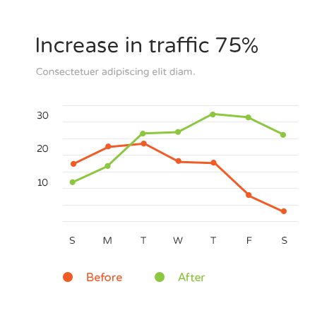
Increased traffic – Responsive websites have higher pageviews and better bounce rates than non-responsive ones because they allow users to view more content at once without having to scroll down or zoom in/out constantly. This means that your site will get more traffic from search engines like Google as well as direct visitors who are interested in finding out more about your products/services
Why You Need to Consider Mobile Responsiveness?
Mobile responsiveness is a must-have for every website today. Even if you’re not a big ecommerce brand, you need to be mobile-friendly.
Here are four reasons why:
1. Mobile Is the Future and It’s Not Going Away
Mobile usage is here to stay. As consumers, we’re spending more time with our phones than at our computers, and as businesses, we need to make sure that we’re taking advantage of this shift in how people consume information.
2. Responsive Design Affects Your SEO Rankings
If you want to get more traffic to your website, you should make sure that it is responsive. Google has stated that responsive design is one of the most important factors when it comes to SEO. If your page isn’t optimized for mobile devices, then you are going to have a hard time getting good rankings in Google’s search results.
3. User-Friendly and Efficient
Mobile responsiveness is the key to a user-friendly experience. With mobile responsive design, you can offer your customers a seamless and consistent experience across platforms.
With mobile responsiveness, you can increase the efficiency of your team and make it easier for your customers to access your products and services.
How To Understand What to Do Next with Your Website?
We’ve just talked about the importance of mobile responsiveness and how it can help your website increase its reach. If you’re ready to take your website to the next level, we’ve got a few tips for you!
First, look at how responsive your current website is. It’s easy to do just visit your site on a mobile device and see if it works well. If not, there are some things you can do to fix that.
Second, consider adding new features or services to your website. This will help you stand out from other businesses in your industry and make sure that people know what you have to offer.
Third, keep working on improving the design of your site so that it’s easy to use on all devices—even when someone’s using their smartphone!
Finally, don’t forget about SEO! Search engine optimization is important because it helps people find your website when they search for something with their device.
At the end of the day, responsive design is about giving users a consistent experience across device types. It is a relatively easy way to ensure that you are reaching the largest audience and gaining access to mobile traffic statistics from Google Analytics. That said, making websites responsive takes some effort and requires research into mobile designs and coding. For small business owners with limited time and resources, this might seem unnecessary. Get in touch with our team at Funtastic WD to evaluate your current website and discuss your options.